Dotdash’s Whisper Glaze
Type: Environmental Graphic Design
Mentor: Despina Macris
Goals and Questions
Whisper Glaze was a project created for Dotdash Wayfinding, Brisbane, to glazing graphics for the studio’s conference room. Concepts were developed and mocked up to embody the goals, values, and essence of Dotdash Studio while aligning with its existing and future projects, brand language, and guidelines.
Exploring the space through drawings, measurements,
and studio observation helped clarify its physicality, key elements, and the intended role of the graphics.
Questions to be Answered:
What needs to be represented?
What are the key elements that need to be communicated?
What are some of the unsaid aspects of Dotdash that form
a larger narrative?
How do we create a spacial experience that would align with the studio’s design goals?
Which medium would convey the message?
Why choose certain visuals and concepts?
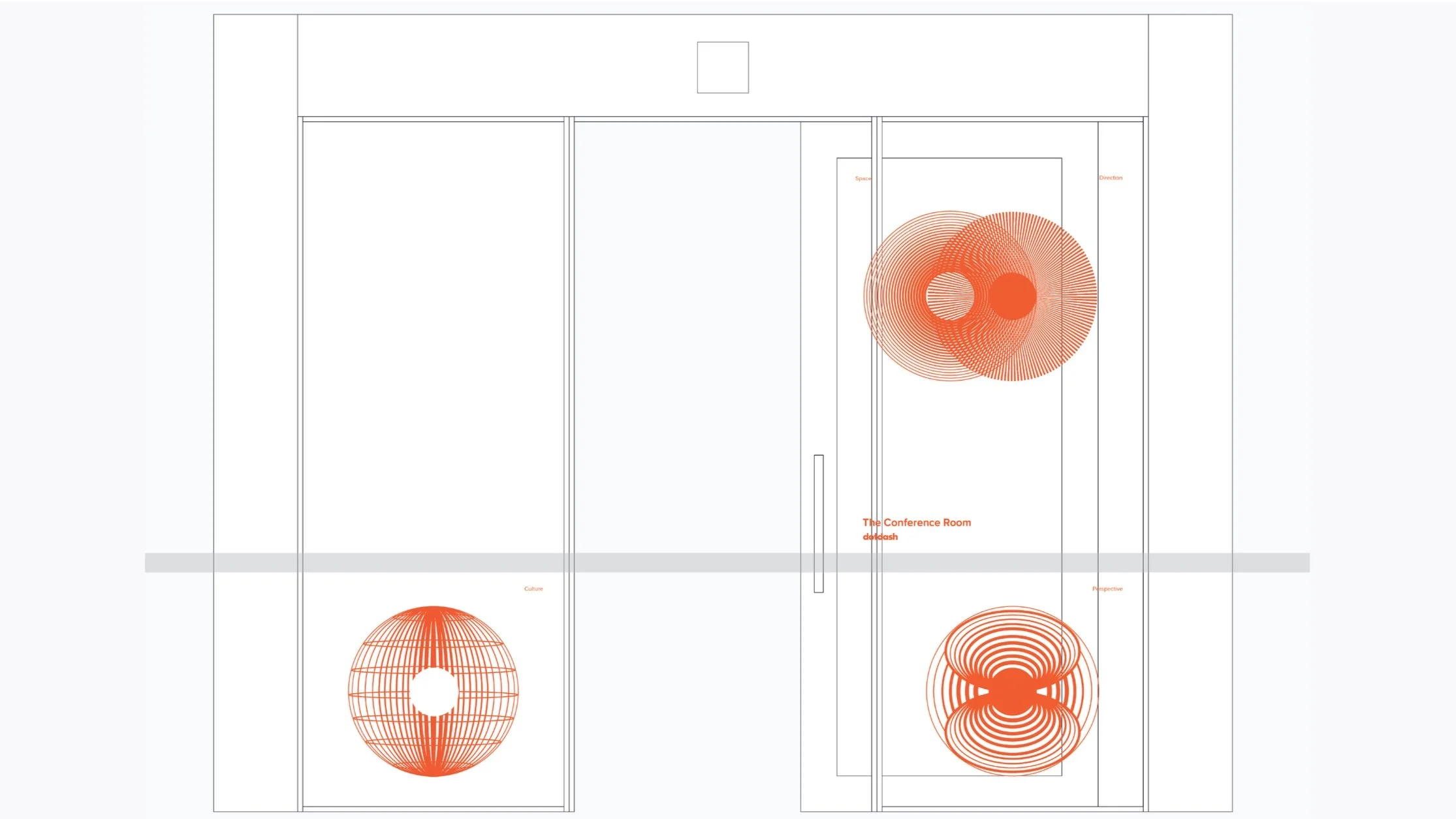
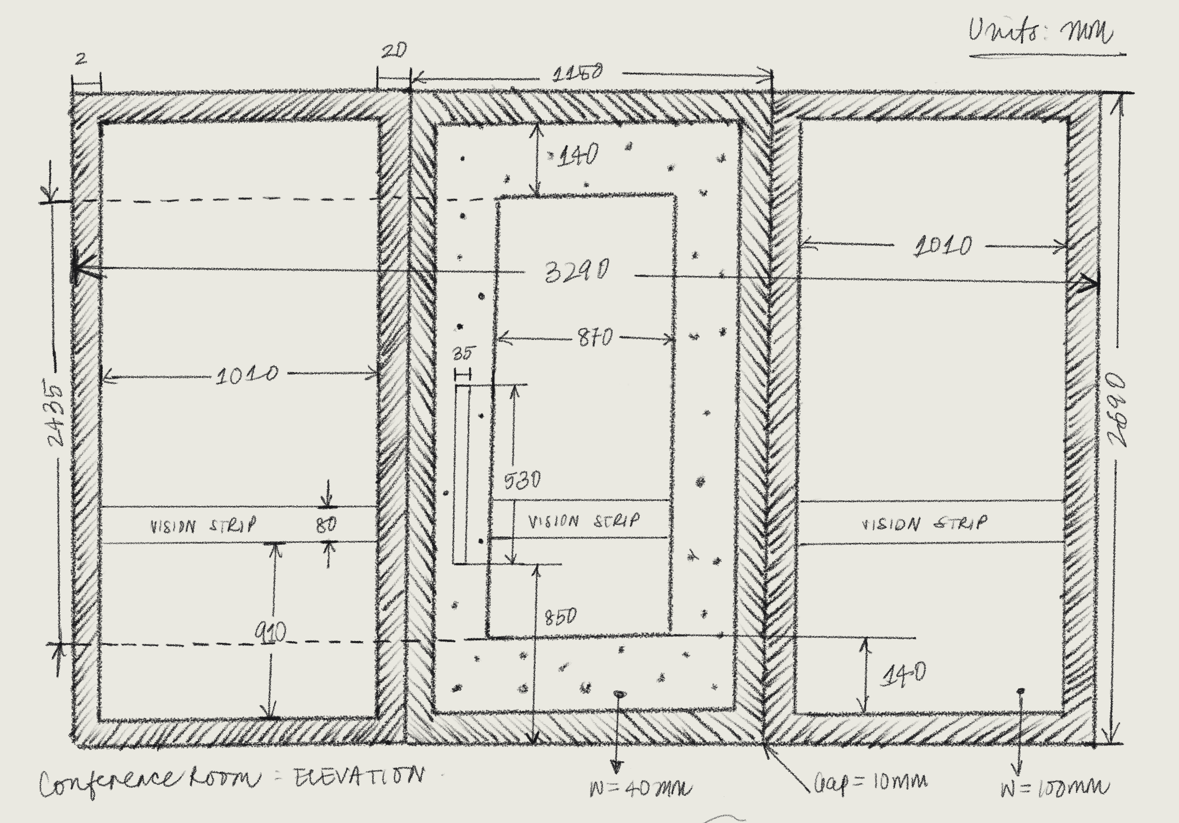
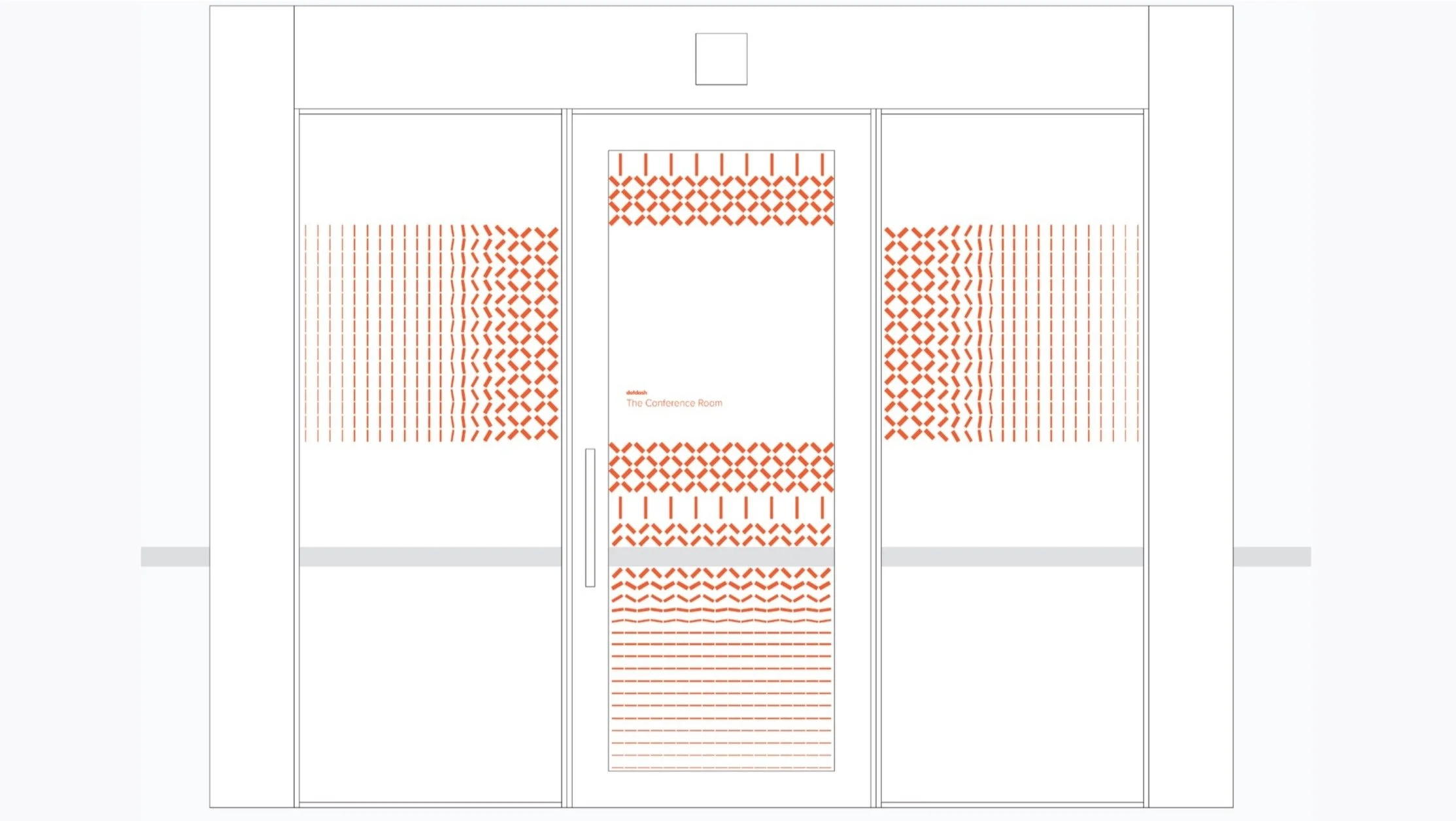
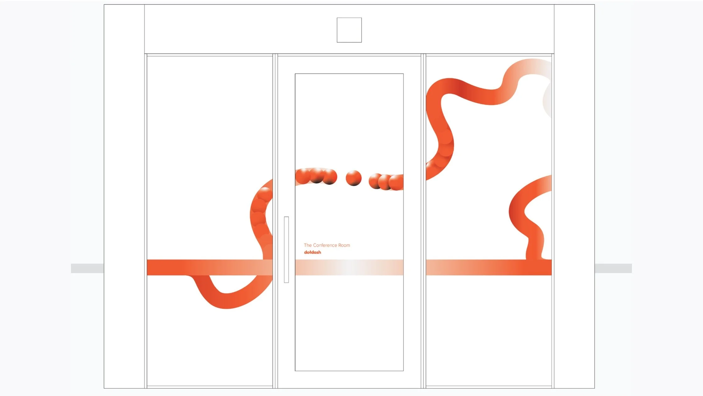
The Elevation Drawing
A scale drawing of the glass panels, sliding door and outer walls of the entrance. Elements such as the table and visible window through the transparent glass were kept in mind.

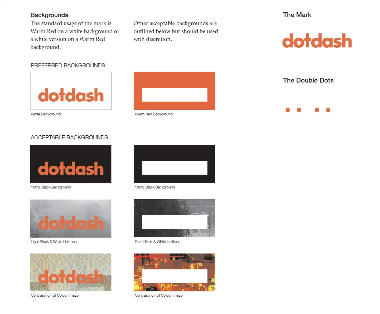
Dotdash: The Brand
Rooted in minimalism, efficiency, and elegance, the brand embodies a quiet graphic presence—what can be described as graphic silence—seamlessly integrating into its surroundings through cultural sensitivity and a multidisciplinary approach. It embraces dimensional integration, where the boundaries between two- and three-dimensional space dissolve, creating a fluid, immersive experience that is both intentional and refined.
The Dotdash Orange
#F15D2F
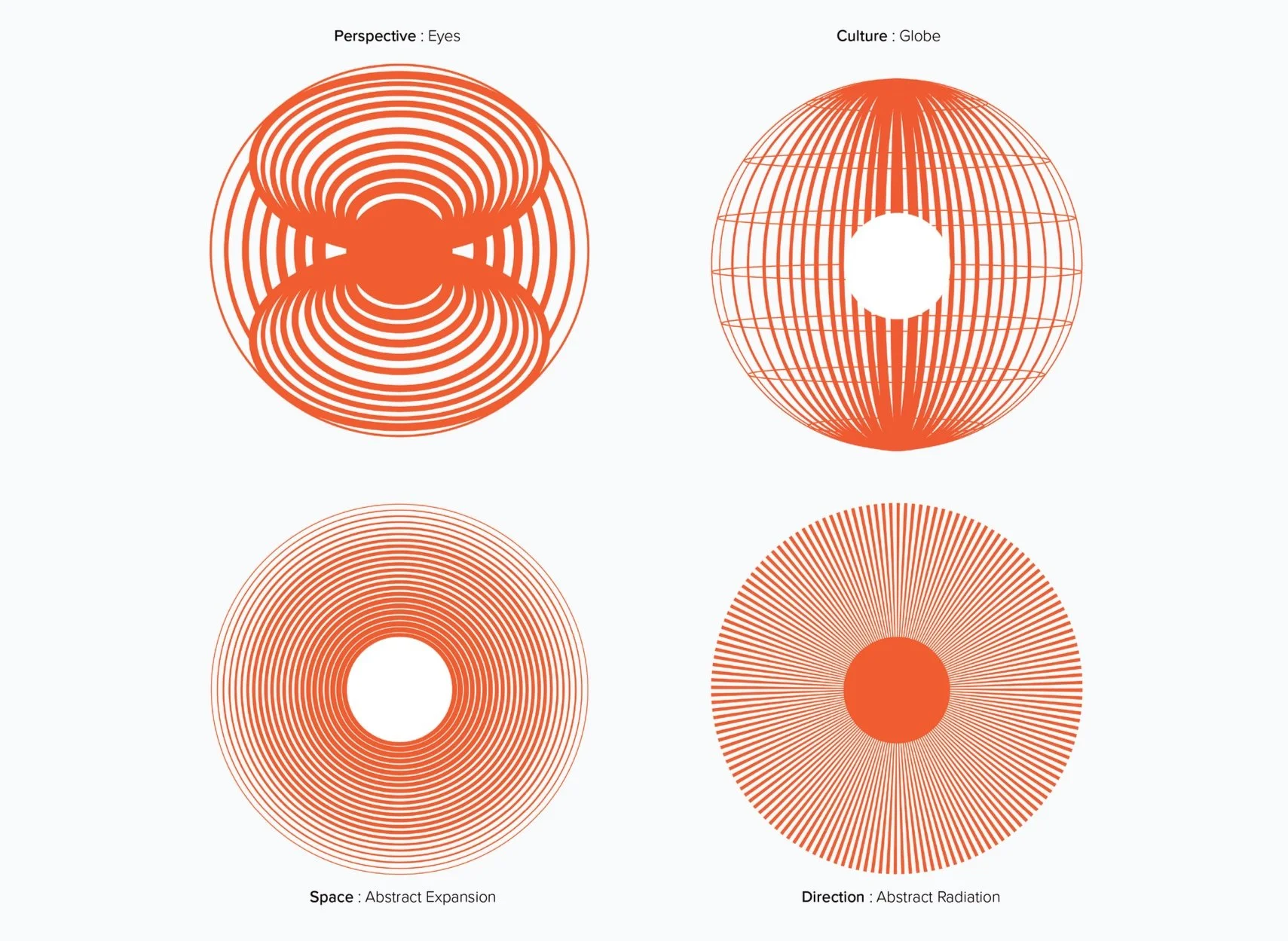
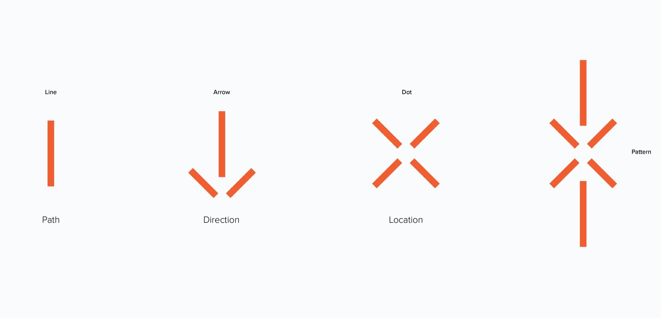
Concept A: The Selective View
“What unfolds beyond the frame you see, and how do you journey through and to it?”
The Essence:
At Dotdash, wayfinding extends beyond signage—it reframes how we experience space. By breaking it into location, direction, and path, each element becomes intentional. In the conference room, graphics were designed to interact with the layered view through the glass wall and window beyond.
Concept B: Path in Perspective
“Where perspectives and sight converge, bridging the two- and three-dimensional worlds”
The Essence:
Formulating a graphic interpretation of how two-dimensional graphics interact with physical spaces and pathways, this exploration focused on the relationship between space and graphic as a unique and functional overlap. Inspired by the Brisbane river.
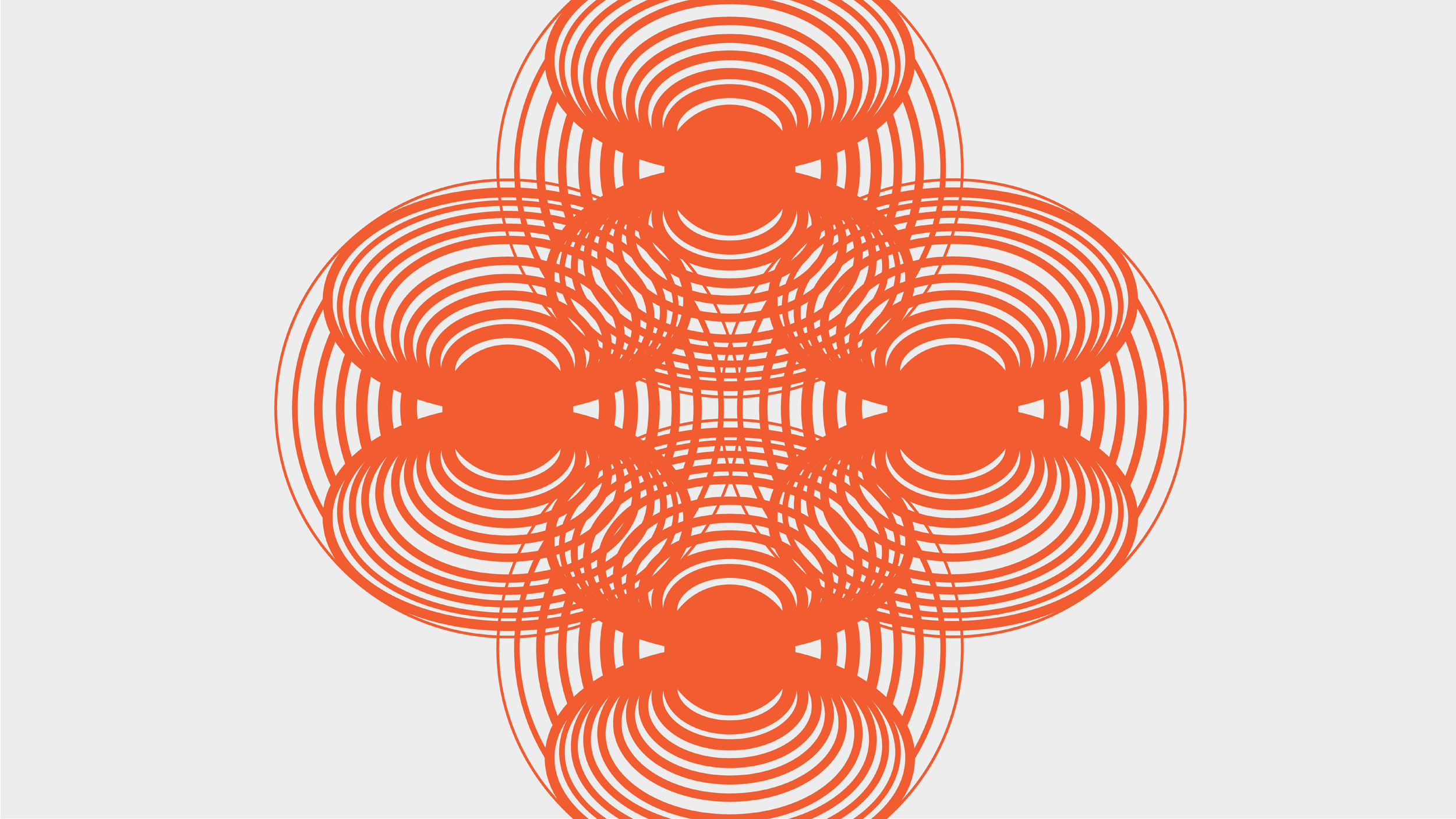
Concept C: Motion in Pathways
“What forms when diverse elements intertwine?”
The Essence:
The concept reflects Dotdash’s multidisciplinary focus on wayfinding, culture, and space. Motion—symbolizing discovery—is evoked through moiré patterns created using Dotdash’s signature double dots, while negative space captures the quiet, integrated presence of signage within the environment.