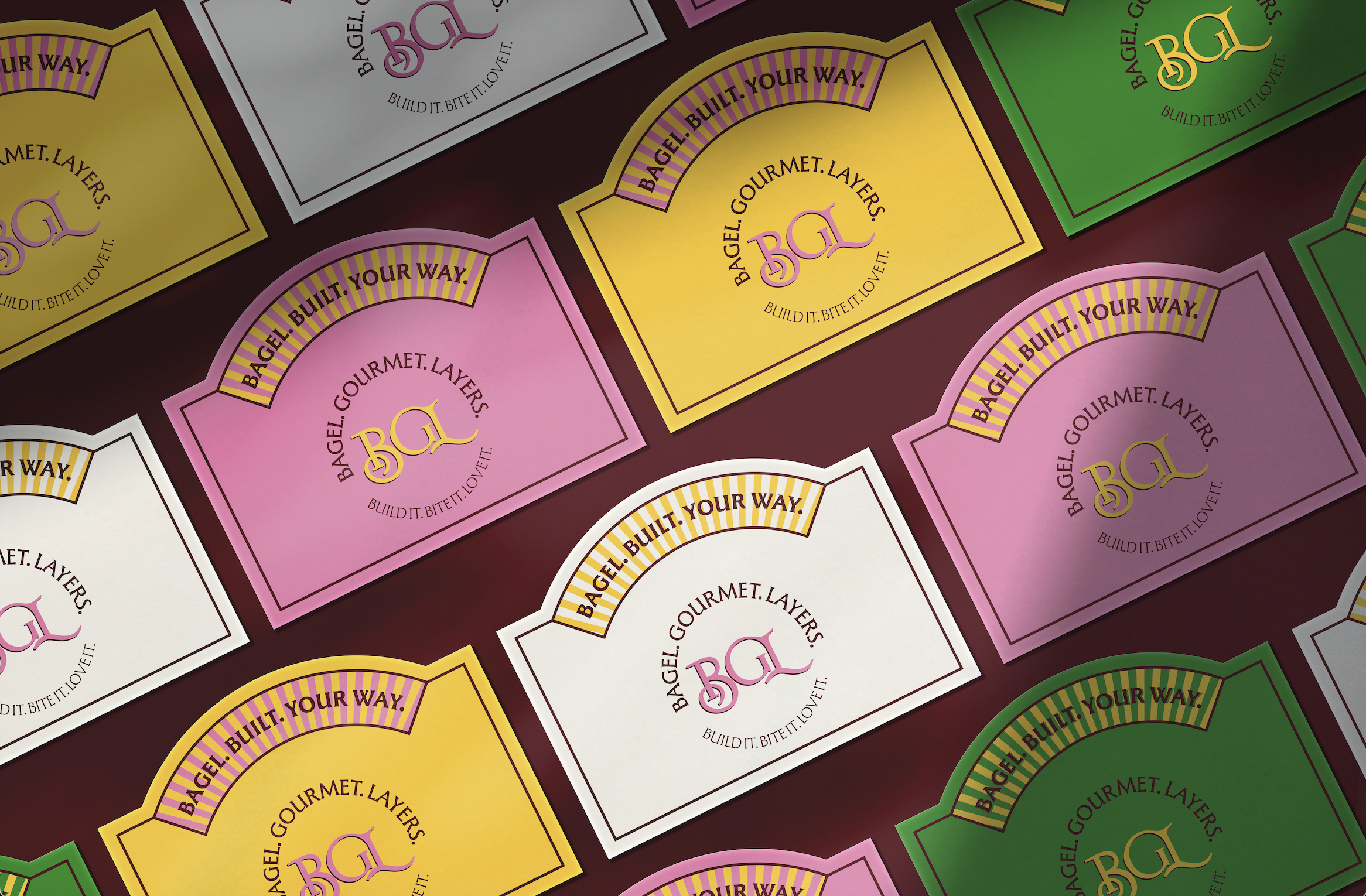
BGL Bagels
Type: Visual Identity, Branding
Collaborator: Muhammad Tayyab Younas
Visual Identity

The Menu Card
The menu card was designed to feel personal, with each customer filling in their own name alongside a quirky tag and customising their order.
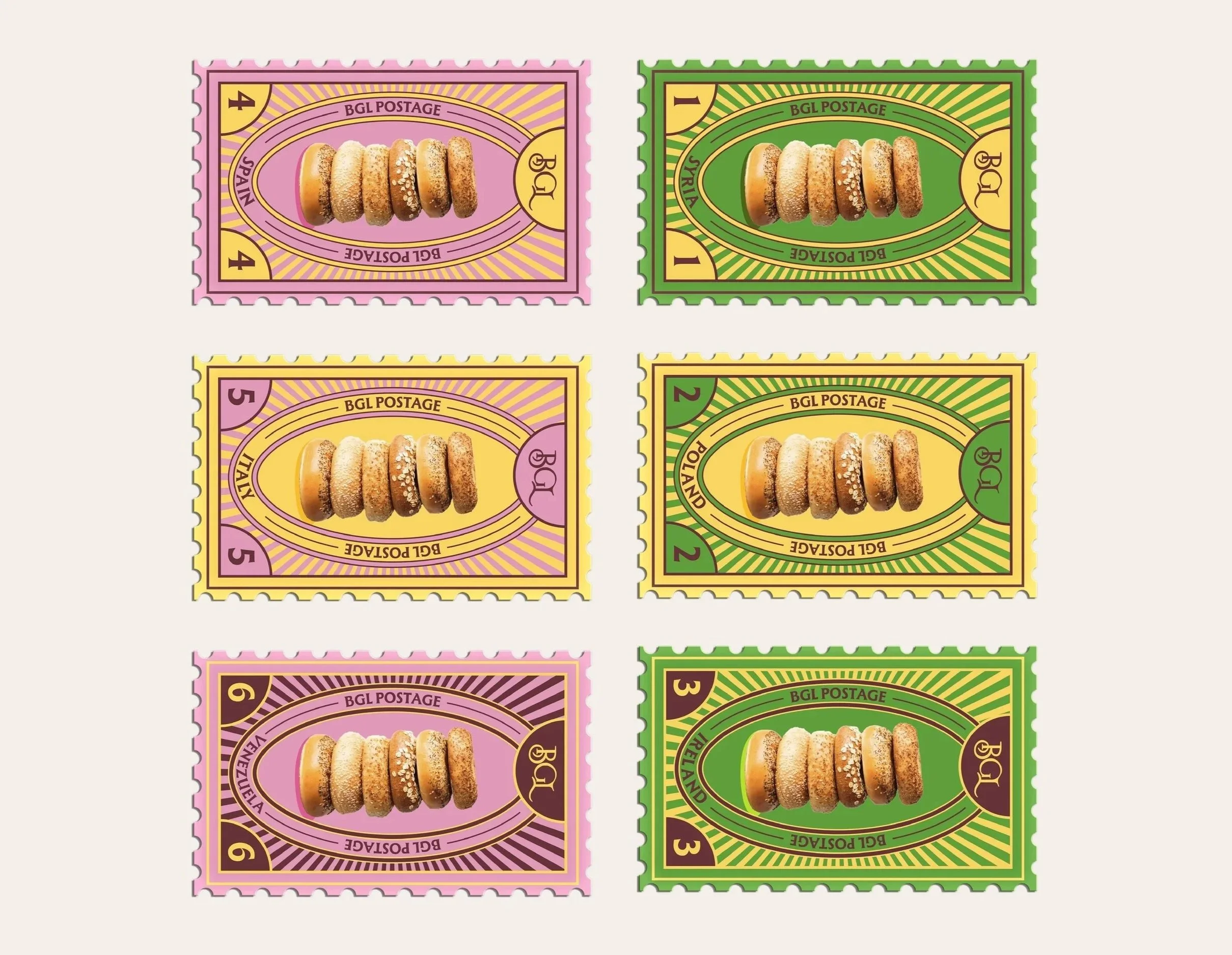
The detachable strip at the bottom works as a collectible stamp system, where each stamp features a location tied to the history of bagels, turning loyalty into something worth keeping.

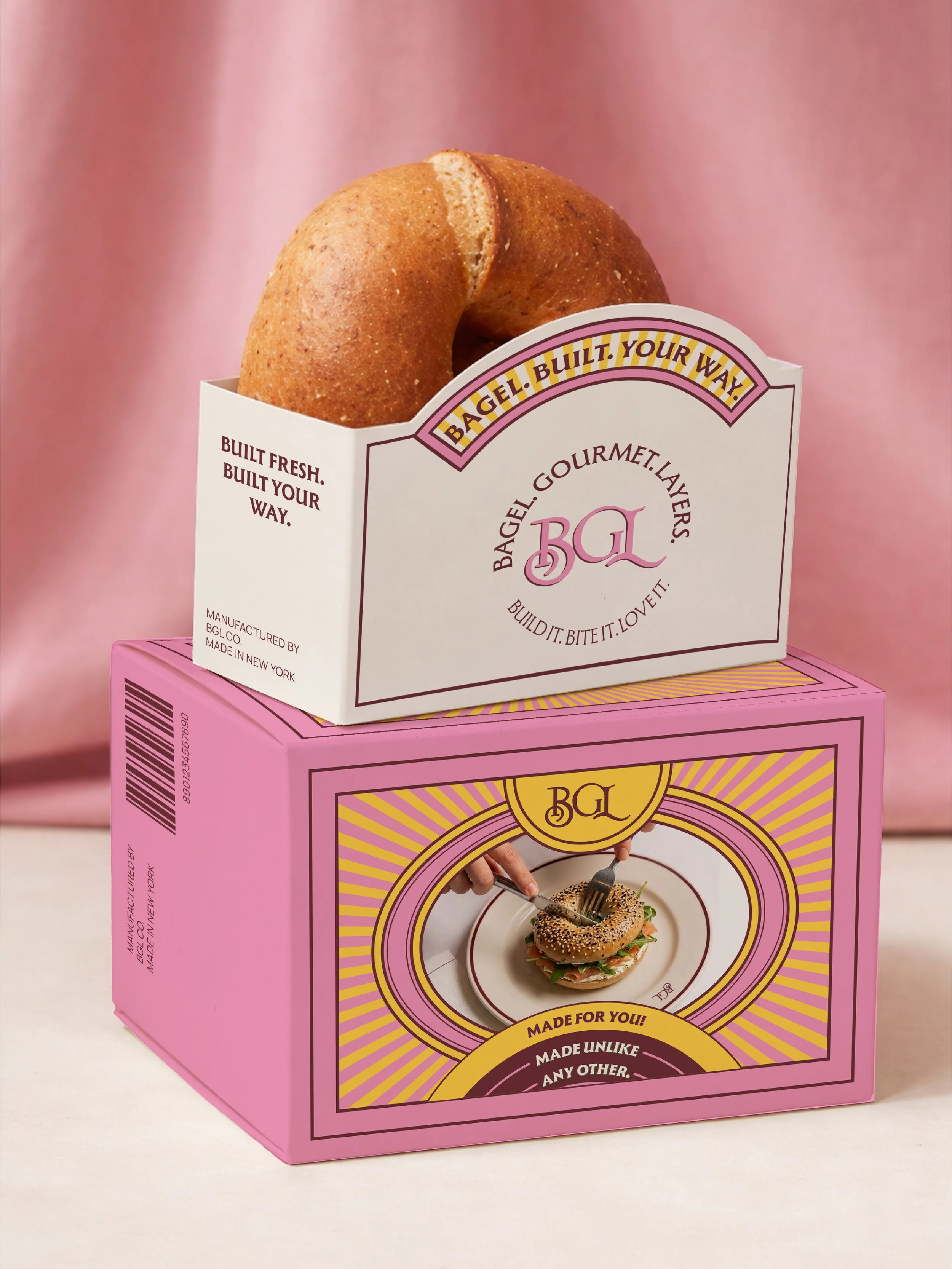
The Because “everything bagel” shouldn’t mean everything feels the same. BGL is built on a simple (and slightly indulgent) idea: if taste is personal, ordering should be too. Every bagel is composed, not picked, layer by layer, exactly how you want it.
The experience goes beyond the bite. An interactive menu becomes your ordering canvas, paired with a collectible stamp system that feels more keepsake than transaction.
Designed for both instant gratification and lasting memory, because at BGL, it’s never just a bagel. It’s yours.
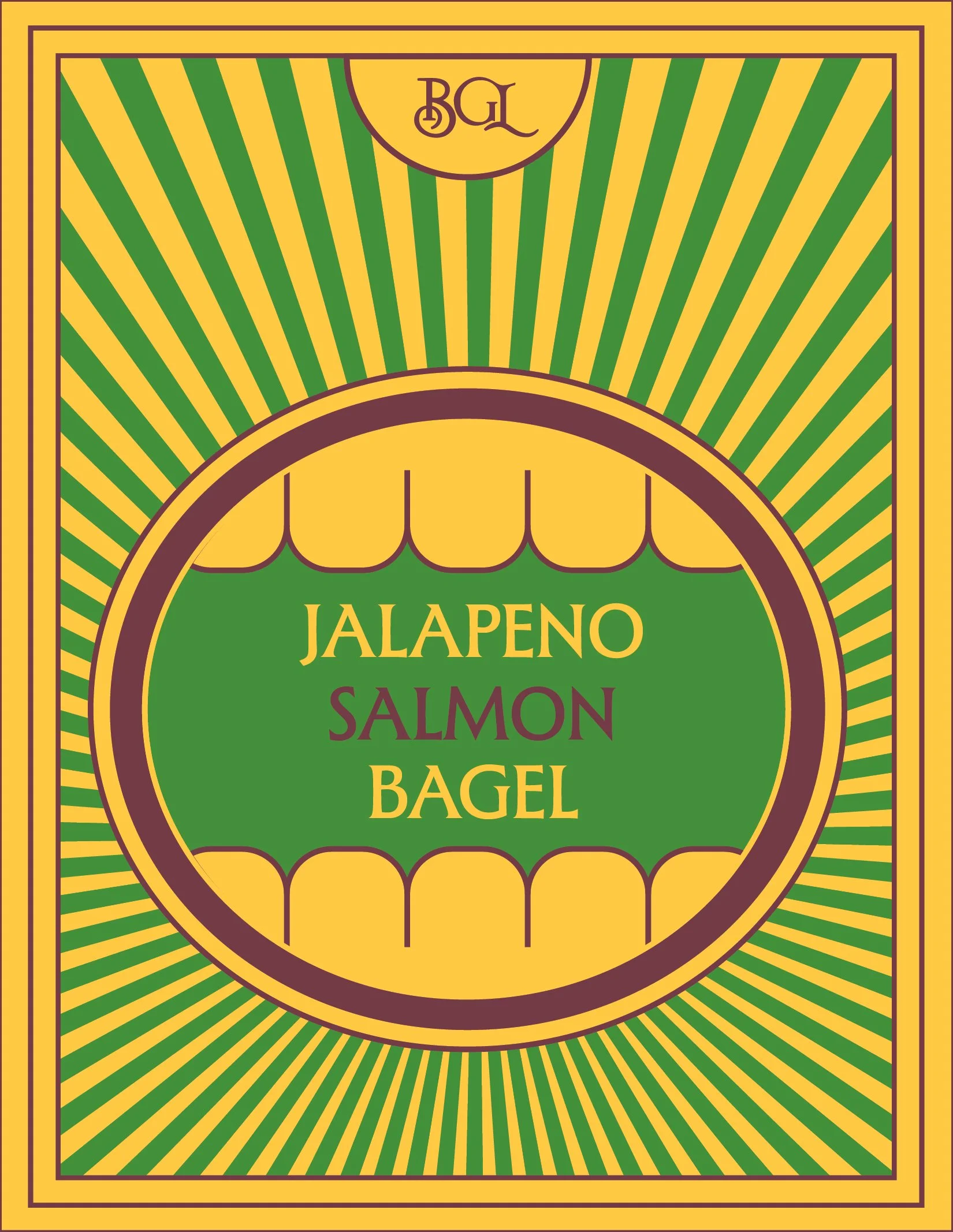
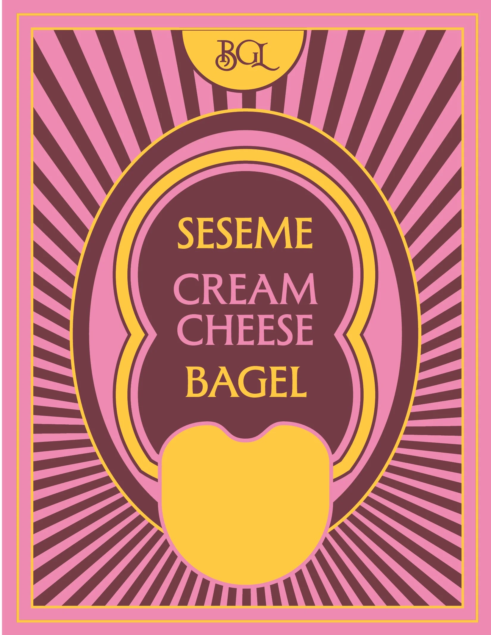
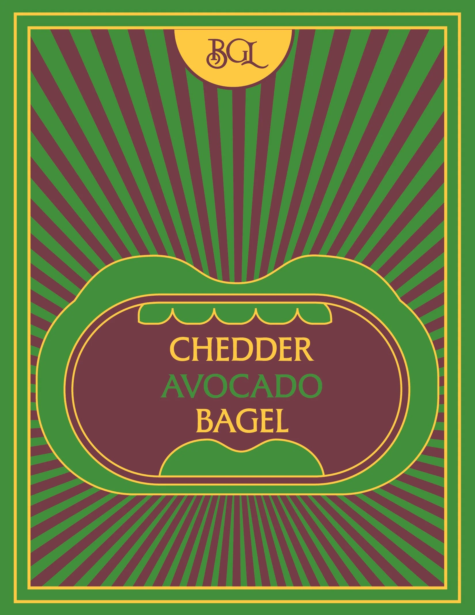
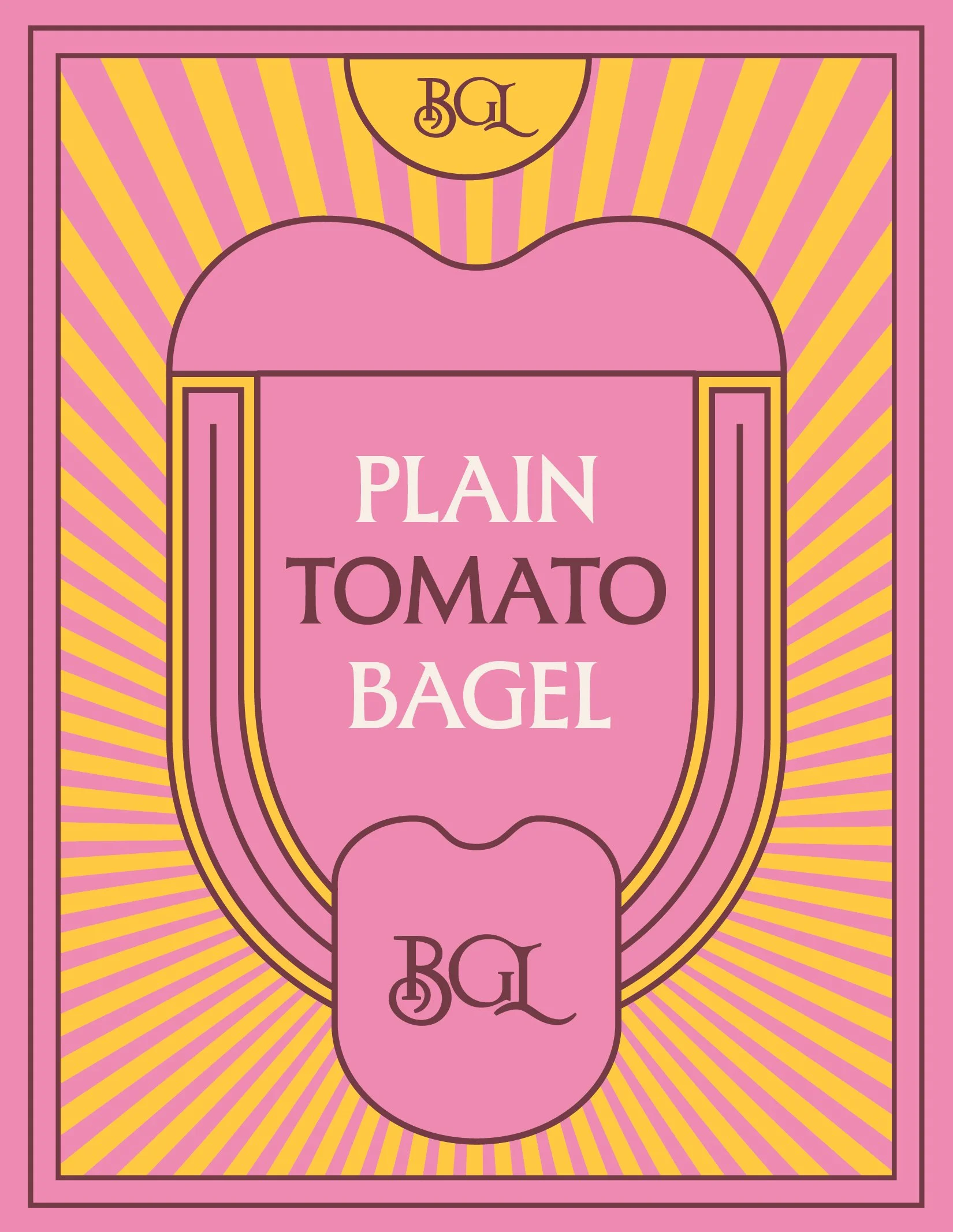
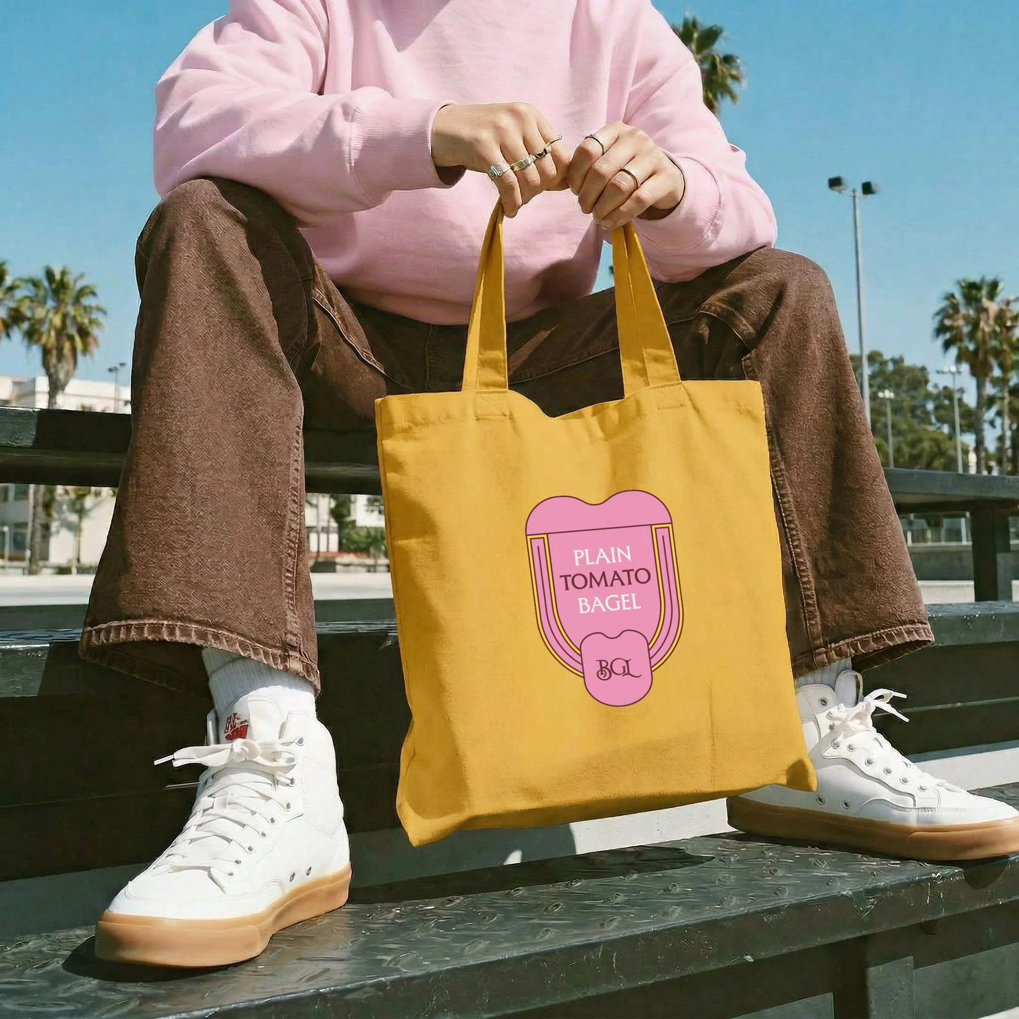
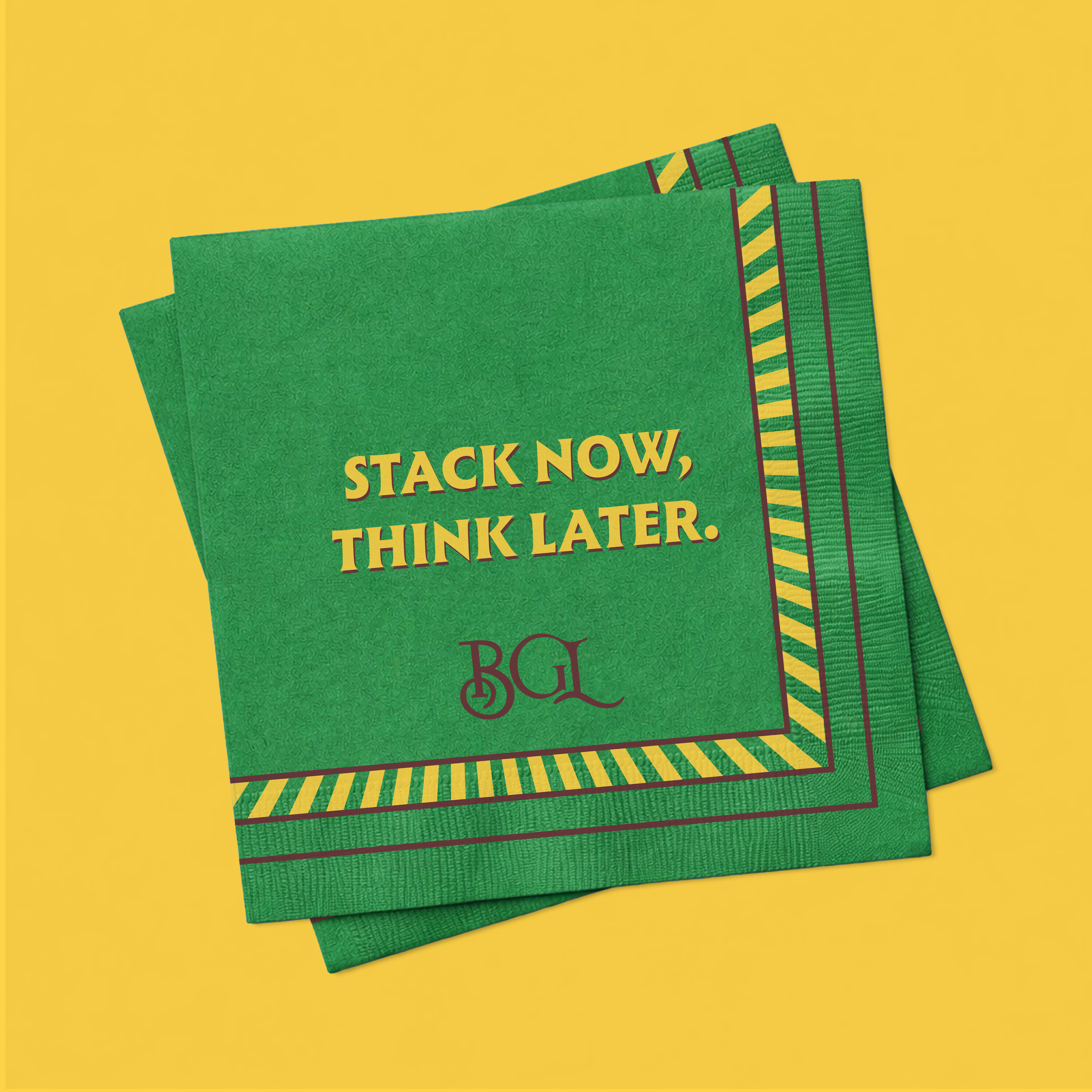
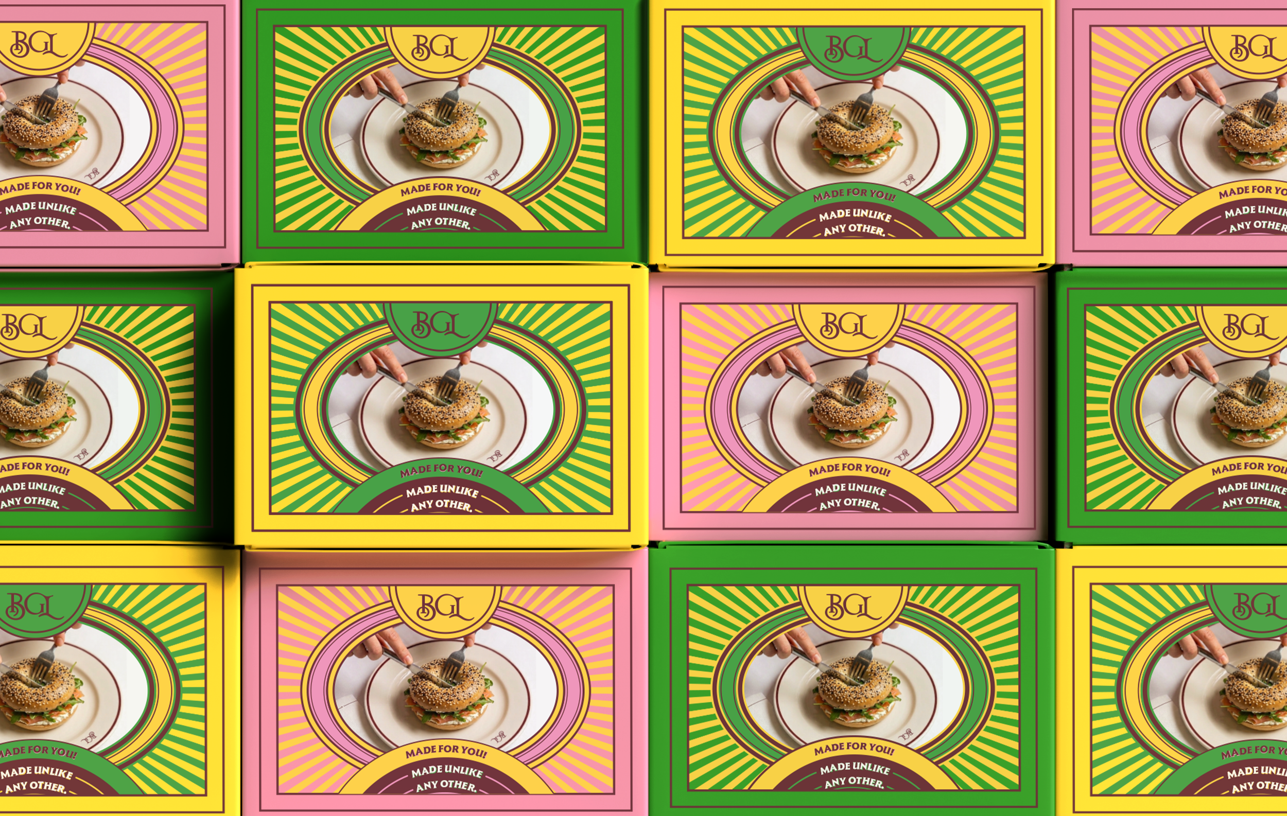
The visual identity leans into a kind of controlled maximalism, rich and indulgent, but not too serious. The logo was designed to feel premium and self-assured, with a slightly quirky edge.
At its core is the idea that everyone orders differently, expressed through a series of expressive mouths, each representing different tastes and preferences. It’s a simple way to make the identity feel more human, varied, and a bit more playful.